
20 Most Interesting Buildings from the last few years
As architects and engineers, we can all appreciate great work. With the dawn of a new year, let’s look back at some great examples of architectural design.
Every New Year brings with it a host of possibilities. Fresh ideas come to the fore, and you start thinking about the interesting buildings you’ll design in the coming months.
The dawn of another year also affords you the opportunity to look back. Many in the industry look for examples of architectural design to inspire them for new projects. The work of others can reinvigorate, or offer ideas about the trends affecting the industry.
Throughout the holiday break, we had the opportunity to look back at buildings from the last few years. That break provided the opportunity for greater reflection. This allowed for some truly interesting buildings to stand out.
With that in mind, let’s take a look back at the architectural achievements of the last few years. Each of these is one of the best examples of architectural work in modern times.
Building #1 – The Speed Art Museum
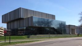
Louisville, Kentucky has hosted the Speed Art Museum since 1927. For almost a century, it has stood as a monument to American art and history.
However, it needed modernising, which is exactly what a firm called wHY brought to the table. It used a technique called “acupuncture architecture”. This line-based design method is most noticeable on the new building’s roof, which has an eye-catching striped pattern.
The method brings a new sense of unpredictability and modernity to a previously predictable building. Couple that with the light and airy interior and you have a museum that’s fit for today’s world.
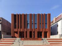
Building #2 – The Raymond G. Perelman Center for Jewish Life
ArchDaily
Many architects shy away from brick. It’s seen as a relic of a bygone era, with most favouring glass and other materials in their work.
However, Saitowitz Architects showed us that brick still has plenty of mileage in 2016. Its work on the Raymond G. Perelman Centre in Philadelphia, Pennsylvania is a testament to that.
Combining red masonry with skylights, the firm created a unique and airy building. There’s no denying that it looks imposing from the outside. But it’s the blend of brick and modern design techniques that makes this one of the best examples of architectural work.
Building #3 - The United States Courthouse – Los Angeles
Courthouses don’t usually offer much opportunity for experimentation. Traditionally brick-based, they place more emphasis on old design choices.
Not so with the United States Courthouse in downtown Los Angeles. The courthouse underwent a redesign in 2016.
SOM combined a cube design with folded glass windows to create an exceptionally modern look. Not only that, but the design also reduces internal heat. Anybody who has been to Los Angeles can tell you that this is a good thing.
It may not have the institutional feel of old courthouses. However, it’s certainly an impressive building.
Building #4 - Tate Modern Switch House
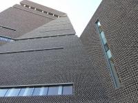
The Tate Modern in London has always pushed boundaries. The gallery’s new Switch House only emphasises that point.
Herzog & de Meuron built the new gallery on the site of an old power station, which is where the Switch House name comes from.
It’s a ten-floor pyramid, which includes some wonderfully precise brickwork inside. As you ascend the structure, this brickwork becomes even more intricate. The interior also hosts everything from wide open spaces to intimate display rooms.
Building #5 – The University of Iowa Visual Arts Building
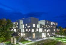
With its angular structure, the University of Iowa’s Visual Arts Building is a true sight to behold. At times, it can look like a strange assortment of cubes stacked on top of one another. Gaps punctuate these sharp shapes, lending the building an even more unique feel.
The architect Steven Holl also added a few creative touches. Some of the floor panels slide out to create balconies. The building also has several vertical shafts, which channel natural light into the building’s central areas.
Building #6 – The Spring Street Salt Shed

You may not think that sea salt could lead to one of the great examples of architectural design. However, the Spring Street Salt Shed in New York will prove you wrong.
The building uses exposed concrete to ensure it stands out from its surroundings. The sharp edges juxtapose some intelligent curves. At a glance, it looks like a giant piece of raw salt. Perfectly suitable for a building that stores so much of the compound.
Building #7 – The Rose Reading Room
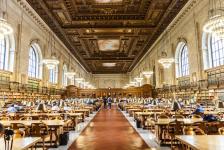
Located in the New York Public Library, the Rose Reading Room is one of the city’s finest examples of architectural design. However, even the classics need sprucing up on occasion. The renovation job fell to WJE Engineers & Architects, who did some fine work.
The restoration didn’t lead to a brand new building. Instead, the firm restored several murals and rosettes, in addition to reinforcing the room’s structure. There are also some nice new touches that lend more light to the room. It still looks traditional. However, the renovation work also means it looks fresh again.
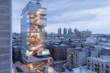
Building #8 - Roy and Diana Vagelos Education Center
ArchDaily
Another building in New York, this education centre makes use of its stairs to great effect. Huge windows highlight the staircase. The building’s jagged design almost makes it seem as though those stairs are on the outside too.
The building itself is essentially a self-contained campus. It contains labs and social study areas, as well as classrooms. The windows also offer plenty of natural light, as well as spectacular views of the city. The interesting geometric patterns that line the exterior only add to its charm.
Building #9 – InScape
You wouldn’t normally expect a meditation room to appear on a list of examples of architectural design. But InScape is different.
It’s the ceilings that make this stand out from other interesting buildings. One features a pattern of interweaving ropes, reminding the viewer of a spider’s web. The other uses bamboo to create a stunning spiral pattern.
Couple that with the high-end interior and you have a meditation studio that’s much more than a few yoga mats.
Building #10 - Dr Chau Chak Wing Building
The Dr Chau Chak Wing Building is one of the more recent additions to Sydney’s University of Technology. It’s also one of the more interesting buildings to emerge from the city for quite some time.
At first glance, everything looks haphazard. The curves and odd assortment of windows make it seem like a climbing wall or paper bag, rather than an educational centre.
The building marries the modern use of windows with Sydney’s urban sandstone. It’s also environmentally-friendly. The architect used sustainable materials throughout. There’s also a 20,000-litre tank on the roof that collects water for the building’s plumbing and irrigation systems.
Building #11 – The Pierre Lassonde Pavilion
Simplicity lies at the heart of this building. Yet it’s still one of the best examples of architectural design to come from 2016.
It all comes down to the stacked structure, which looks almost modular. Starting from a large base, there are three floors, each smaller than the one below. The design looks like a pyramid, but there’s plenty of modern flair to set it apart. The large windows let in lots of light, and the angled block at the front is elegant in its simplicity.
Building #12 – The Faena Forum
Miami’s Faena Forum comes in two parts. The first is a huge cube. This hosts meeting rooms, but its centrepiece is a huge 40-foot atrium.
The second is a stunning cylinder with a spiral design pattern, which houses more meeting rooms. A dome caps the cylinder, with a skylight bathing the rooms below in natural light.
This is one of those designs that shows how different pieces of geometry can stack together. The clash of sharp cube edges and rounded cylinders make these a pair of 2016’s most interesting buildings.
Building #13 – The Pennovation Center
All seems normal when you view Philadelphia’s Pennovation Centre from the front. The large windows impress, but it may seem like there’s nothing to set this apart from any other building.
Then you walk to the right-hand side. Suddenly, a normal building transforms. Sharp points and angled windows jut out from the side, offering a crystal-like aesthetic. Steel and glass merge to create a harsh, yet inspiring structure. Any illusions of standard design disappear as soon as you see it.
Building #14 – The World Trade Center Oculus

The US$4 billion price tag alone sets this apart as one of the most interesting buildings of 2016. Happily, its aesthetic also makes it a joy to behold.
From the ground, it appears that this transportation hub has a giant set of skeletal ribs for a roof. These “ribs” both obscure and offer slight glimpses of the New York skyline. They also allow for some nice light patterns to form when the light hits them in the right way.
Architect Santiago Calatrava offers up a blinding white interior that greets you when you walk inside. The building looks nothing like anything around it, which makes it all the more noteworthy.
Building #15 - The Port House
The Port House in Antwerp used to be a fire station. That’s still clear to see, as the main building bears many hallmarks of traditional design.
The architects combined a restoration job with an extension to create this structure. The old building looks fresher than ever; no longer derelict and offering a lesson in symmetry to all who see it.
However, the huge gem extension offers a modern contrast to the traditional design. At times, it looks like two buildings pasted together.
Building #16 – The SFMOMA Expansion
The San Francisco Museum of Modern Art has long attracted those with a flair for design. So, it’s only natural that its 2016 extension would become one of 2016’s best examples of architectural design.
Resembling sheets of cascading ice from the outside, it’s the interior design that really stands out. The building has a stunning staircase, while the museum’s audio guides automatically determine where you are in the building. It’s a modern design for a modern museum.
Building #17 – The Oasia Hotel
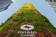
Green and red are the colours of the day in Singapore’s Oasia Hotel. From a distance, it looks almost like a spectacularly complex matchstick building. However, closer inspection reveals a red aluminium mesh, which envelopes the entire building.
Architecture firm WOHA combines this with a huge amount of greenery. The building provides natural habitats for wildlife in the centre of an urban setting. It also has several sky gardens for hotel visitors to enjoy.
Building #18 – The Croton Filtration Plant
The most interesting thing about this building is that you can’t even see it. This would normally exclude it from a list of the best examples of architectural work. But for a filtration plant, not being able to see the building is actually a plus.
Located underground, it’s what’s on top that makes this one of the most interesting buildings of 2016. A huge driving range, accessible from the ground, adorns the roof of the plant. There’s also several nice water features, which also serve to capture any run-off from the plant.
Building #19 - Via West 57th Street
Have you ever heard the term “courtscraper”? It’s unlikely, unless you’ve heard about Via West 57th Street.
Architectural firm BIG coined the term for their 2016 building. It combines a huge courtyard at its base with a tower shaped like a tetrahedron. The tower hosts apartment blocks, instantly setting it apart from the standard high-rises you’re used to seeing.
Building #20 – The National Museum of African American History and Culture

This is one of the most interesting buildings because of what its design represents, rather than how it looks. From the underground level, visitors ascend through a chronological history of African Americans. Each floor moves the story forward, in what the architect calls a “narrative construction”.
Having said that, the building itself looks the part too. It looks almost crown-like from the outside, with ornate metal patterns guarding the large windows.
Conclusion
Each of these buildings serve as great examples of architectural design in their own way. Some offer symbolism. Others combine the traditional with the modern. A select few use ideas that most people wouldn’t even dream of. The common thread is that all are some of the most interesting buildings of the last few years.
If you’re a budding engineer or architect, you can’t help but take inspiration from these examples. Maybe you have similarly innovative design ideas of your own. If so, ArchiStar Academy can help. We offer some of the world’s leading digital design software training at industry-best prices. Furthermore, ArchiStar Academy offers training courses that will help you turn your ideas into reality.
ArchiStar Academy offers several courses across the spectrum of digital design software. You’ll develop your skills, allowing you to create more accurate and functional models.
Please don’t hesitate to get in touch with Archistar Academy today if you have any questions.
If you would like to share your thoughts on our blog, we’d love to hear from you!
Get in touch with the ArchiStar Academy community via Facebook.
Posted on 20 Jan 2020